
Payment Success UI
 Kyle Y. Parsotan
How to Build a Modern Payment Success UI with Animated SVG & Confetti 🎉 A polished...
How to Build a Modern Payment Success UI with Animated SVG & Confetti 🎉
A polished Payment Success UI is more than just a confirmation message — it reassures users, builds trust, and adds a delightful finishing touch to the checkout experience.
In this tutorial, you’ll learn how to build a modern dark-themed payment confirmation card with:
- ✅ Animated SVG checkmark
- ⭕ Drawing circle animation
- ✨ Soft glow effect
- 🎉 Confetti celebration
- 💳 Clean transaction details layout
You can follow along step-by-step and copy the provided code snippets.
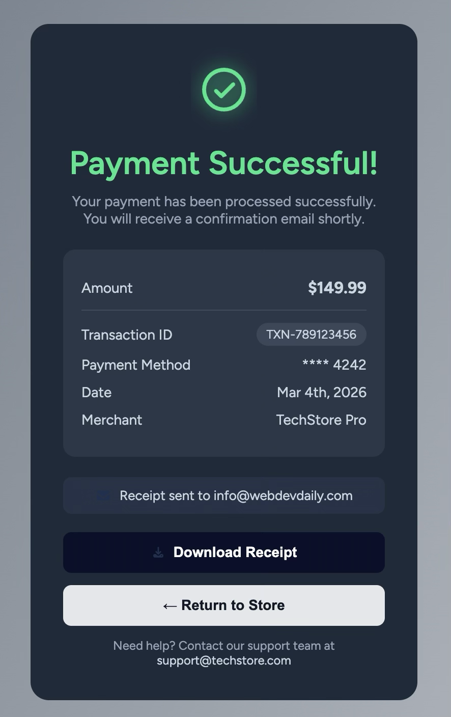
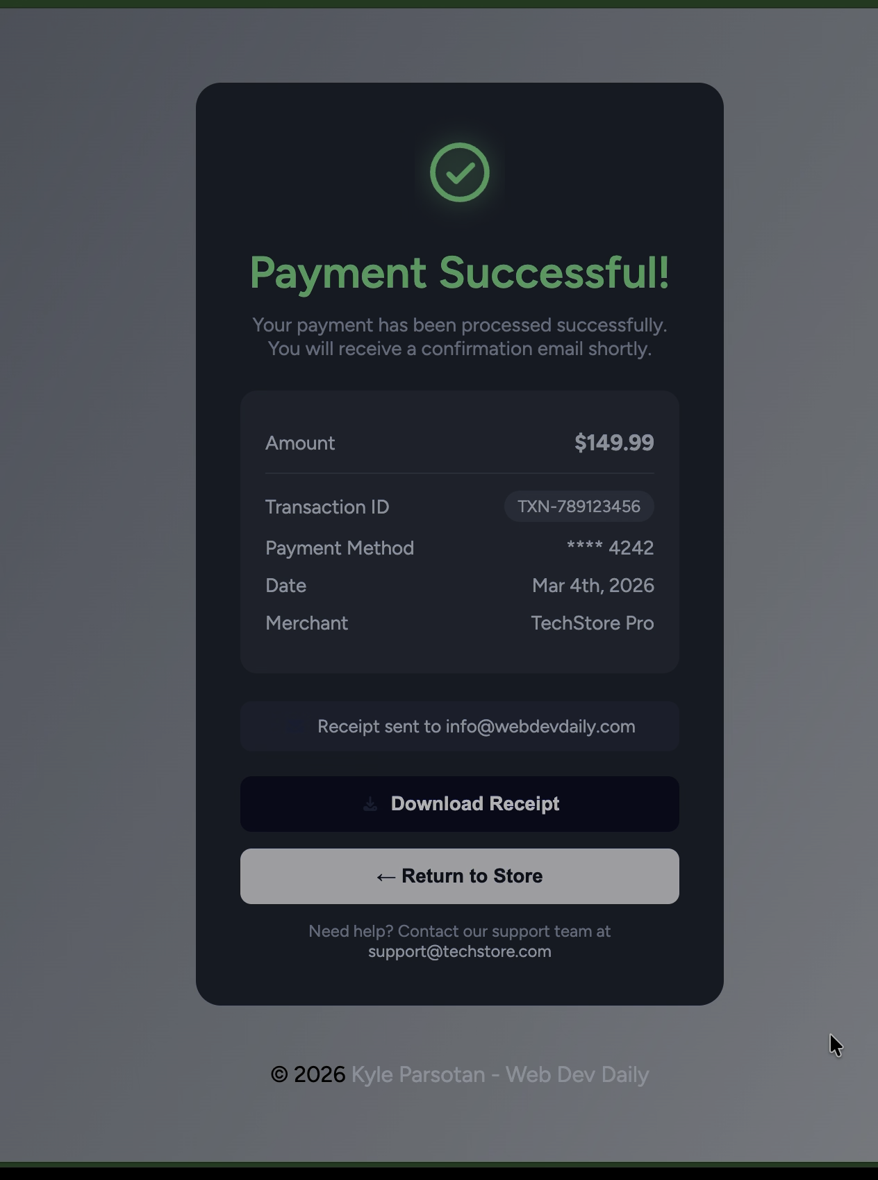
🎨 Final Result Preview
1️⃣ Project Structure
Create this simple folder structure:
payment-success-ui/
├── index.html
├── style.css
├── js.js
└── assets/
2️⃣ HTML Structure
Here’s the core layout of the card.
📄 index.html
<!doctype html>
<html lang="en">
<head>
  <meta charset="UTF-8" />
  <meta name="viewport" content="width=device-width, initial-scale=1.0" />
  <link rel="stylesheet" href="style.css" />
  <title>Payment Successful UI</title>

  <!-- Confetti Library -->
  <script src="https://cdn.jsdelivr.net/npm/canvas-confetti@1.6.0/dist/confetti.browser.min.js"></script>
</head>

<body>
  <main class="card">

    <!-- Animated Success Icon -->
    <div class="card__icon">
      <svg class="success-icon" viewBox="0 0 100 100">
        <circle class="glow" cx="50" cy="50" r="40" />
        <circle class="success-ring" cx="50" cy="50" r="30" fill="none"/>
        <path class="success-check" fill="none" d="M38 52l8 8 18-18"/>
      </svg>
    </div>

    <h1 class="card__title">Payment Successful!</h1>

    <p class="card__description">
      Your payment has been processed successfully.
    </p>

    <div class="payment-box">
      <div class="row">
        <span>Amount</span>
        <strong>$149.99</strong>
      </div>

      <hr />

      <div class="row">
        <span>Transaction ID</span>
        <span class="badge">TXN-789123456</span>
      </div>

      <div class="row">
        <span>Payment Method</span>
        <span>**** 4242</span>
      </div>
    </div>

    <button class="btn btn-primary">
      Download Receipt
    </button>

  </main>

  <script src="js.js"></script>
</body>
</html>
3️⃣ Styling the Card
🎨 style.css
Start with base styling:
:root {
  --card-bg: #1f2a3a;
  --inner-bg: #2b3748;
  --primary: #19e68c;
  --text-muted: #94a3b8;
}

body {
  font-family: sans-serif;
  height: 100vh;
  display: flex;
  justify-content: center;
  align-items: center;
  background: linear-gradient(120deg, #5f6b7a, #c7cbd1);
}
Card Layout
.card {
  width: 380px;
  background: var(--card-bg);
  border-radius: 18px;
  padding: 32px;
  text-align: center;
  color: white;
}
4️⃣ Animated SVG Success Icon
This is the magic ✨
SVG Animation Styles
.card__icon {
  width: 120px;
  height: 120px;
  margin: 0 auto 20px;
  display: flex;
  justify-content: center;
  align-items: center;
}

.success-icon {
  width: 120px;
  height: 120px;
}

.glow {
  fill: #19e68c;
  opacity: 0.15;
  filter: blur(12px);
}

.success-ring {
  stroke: #19e68c;
  stroke-width: 6;
  stroke-dasharray: 188;
  stroke-dashoffset: 188;
  animation: draw-ring 0.8s ease-out forwards;
}

.success-check {
  stroke: #19e68c;
  stroke-width: 6;
  stroke-linecap: round;
  stroke-linejoin: round;
  stroke-dasharray: 40;
  stroke-dashoffset: 40;
  animation: draw-check 0.5s 0.8s ease forwards;
}

@keyframes draw-ring {
  to { stroke-dashoffset: 0; }
}

@keyframes draw-check {
  to { stroke-dashoffset: 0; }
}
📌 Add an Animation Demo Image
5️⃣ Add Confetti Celebration
📄 js.js
document.addEventListener("DOMContentLoaded", () => {
  setTimeout(() => {
    confetti({
      particleCount: 120,
      spread: 100,
      origin: { y: 0.6 }
    });
  }, 1300);
});
This delay ensures confetti appears after the check animation completes.
6️⃣ Payment Details Box Styling
.payment-box {
  background: var(--inner-bg);
  border-radius: 12px;
  padding: 18px;
  margin-bottom: 20px;
  text-align: left;
}

.payment-box .row {
  display: flex;
  justify-content: space-between;
  margin: 10px 0;
}
7️⃣ Buttons
.btn {
  width: 100%;
  padding: 12px;
  border-radius: 8px;
  border: none;
  cursor: pointer;
  font-weight: 600;
}

.btn-primary {
  background: #0b0f2b;
  color: white;
}
💡 Why SVG Instead of Font Icons?
SVG allows:
- Stroke drawing animations
- Precise timing control
- Better scalability
- Cleaner microinteractions
This technique is commonly used in fintech dashboards and checkout flows.
🎯 Conclusion
In this project, you learned how to:
- Structure a clean payment confirmation card
- Animate an SVG checkmark
- Create a smooth circle drawing effect
- Add celebratory confetti
- Build a modern fintech-style UI
Small microinteractions like this dramatically improve user experience and perceived product quality.
📌 Add Your Live Demo Link Here
[View Live Demo](https://github.com/Kyl67899/paymentSuccessfulUI)
[Github Repo](https://kyl67899.github.io/paymentSuccessfulUI/)
If you enjoyed this tutorial, consider turning it into:
- A CodePen demo
- A YouTube walkthrough
- A GitHub repo with README
- A UI case study post
Happy building 🚀